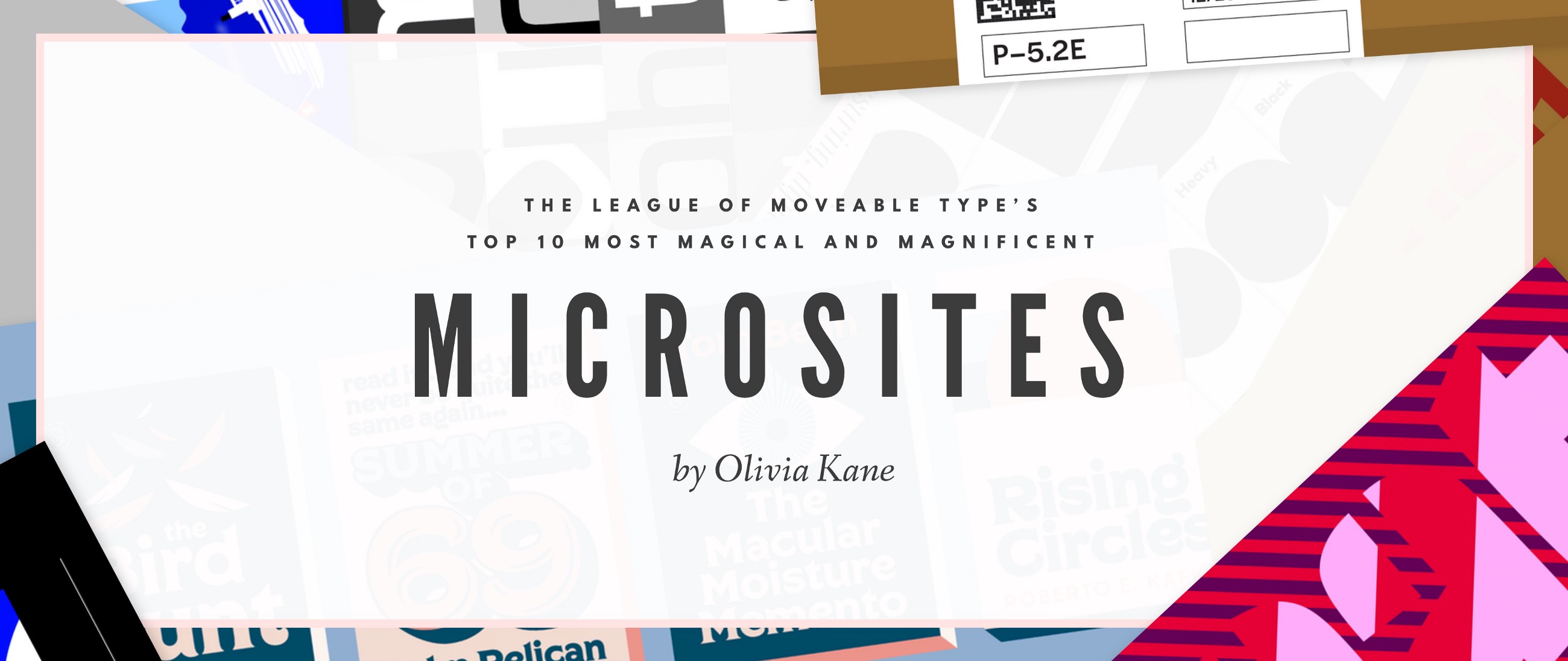
For those that aren’t familiar, microsites are basically digital adaptations of type specimens. For those that aren’t familiar with type specimens (don’t be embarrassed, we’re all learning here), type specs have been used to advertise and promote typeface designs since the early days of metal type. Microsites exist for the same purpose, carry a similar spirit, yet are fairly unknown to those outside of the really nerdy type-isphere. Which sucks.
Naturally, microsites appeal to the type aficionado, but it shouldn’t stop there! These sites are like galleries filled with fantastic typography, graphic, web, and interactive design, and they should be enjoyed by all.
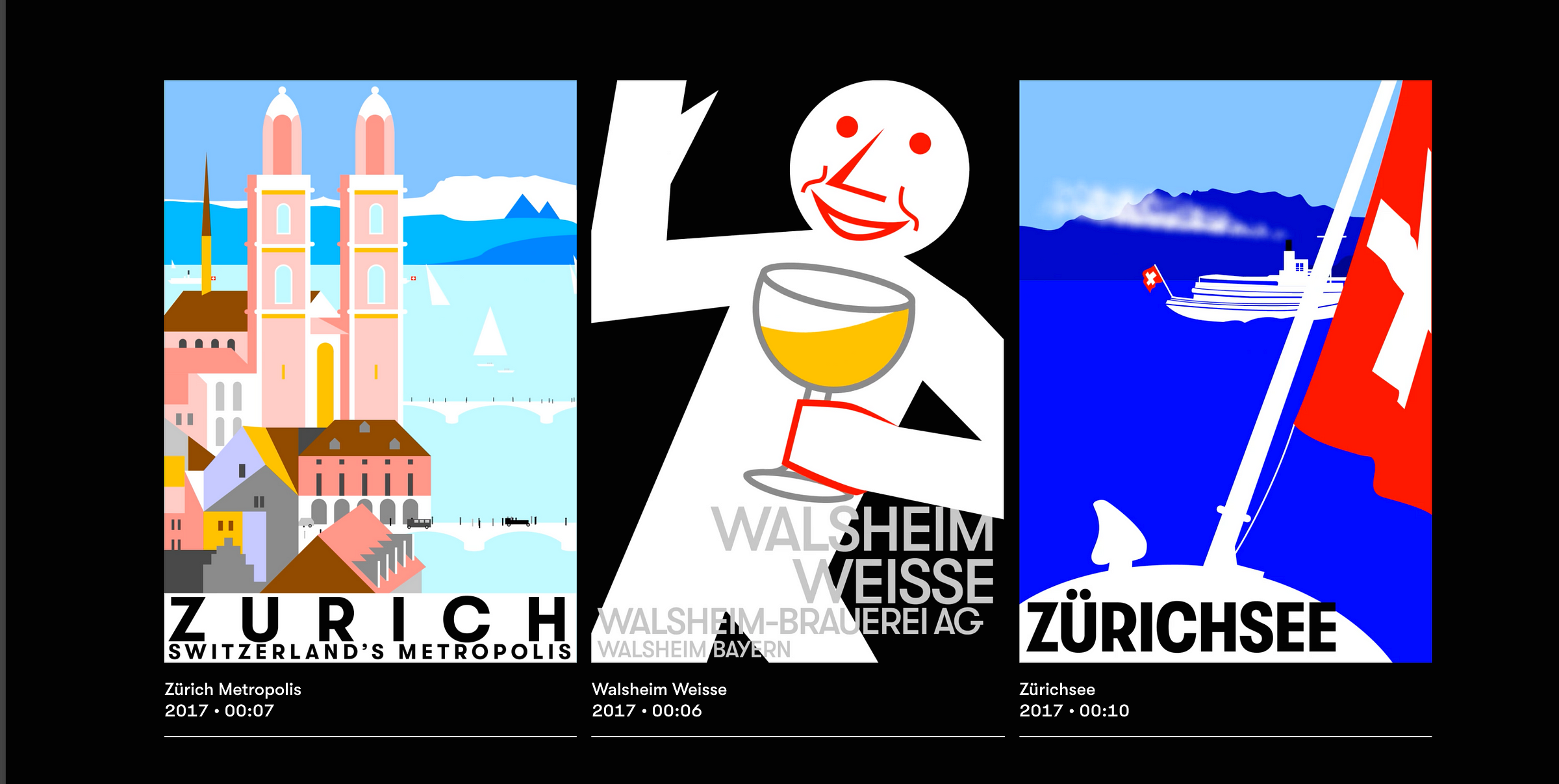
Walsheim by Grilli Type (gt-walsheim.com)
Microsites are especially rewarding when I can come out of one feeling like a more informed and history-conscious designer. Many of Grilli Type’s other microsites are crowd-favorites (America and Cinetype, for example), but for me and Micah, this one stood out from the group.
Also, let it be known I’m a sucker for revivals, so in that respect, this one was hard to beat. Grilli Type brings back type originally drawn over a hundred years ago, and gives a thorough background of the original artist, Otto Baumberger, and his lithography sketching and printing process.
It’s playful, attractive, and thoughtful; not only that, but you get to brush up on your type/design history.
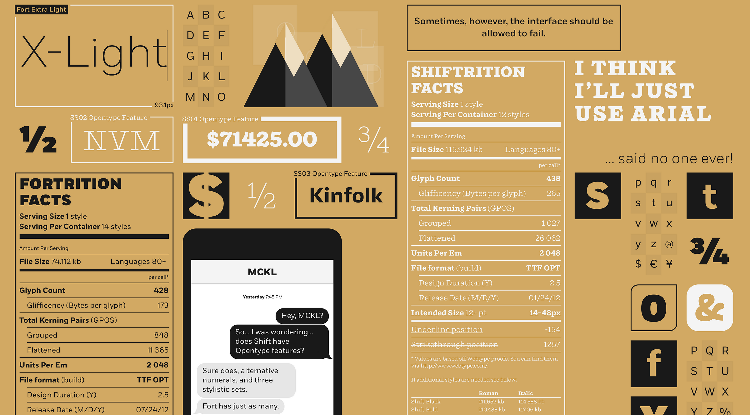
Shift and Fort by MCKL and Webtype (mckl.webtype.com)
I’ll be honest, at first I was so excited about the design of this site I didn’t notice there were two completely different families here. Two for the price of one! I love the approach of showcasing two beautiful designs in one microsite.
To all those people that want to know how to combine contrasting typefaces, this one’s dedicated to you. I’d also like to add that this site — except for a few illustrations and a wonderfully sneaky gif — is designed entirely with typography! It’s a great testimony to just how expressive these faces are all on their own.

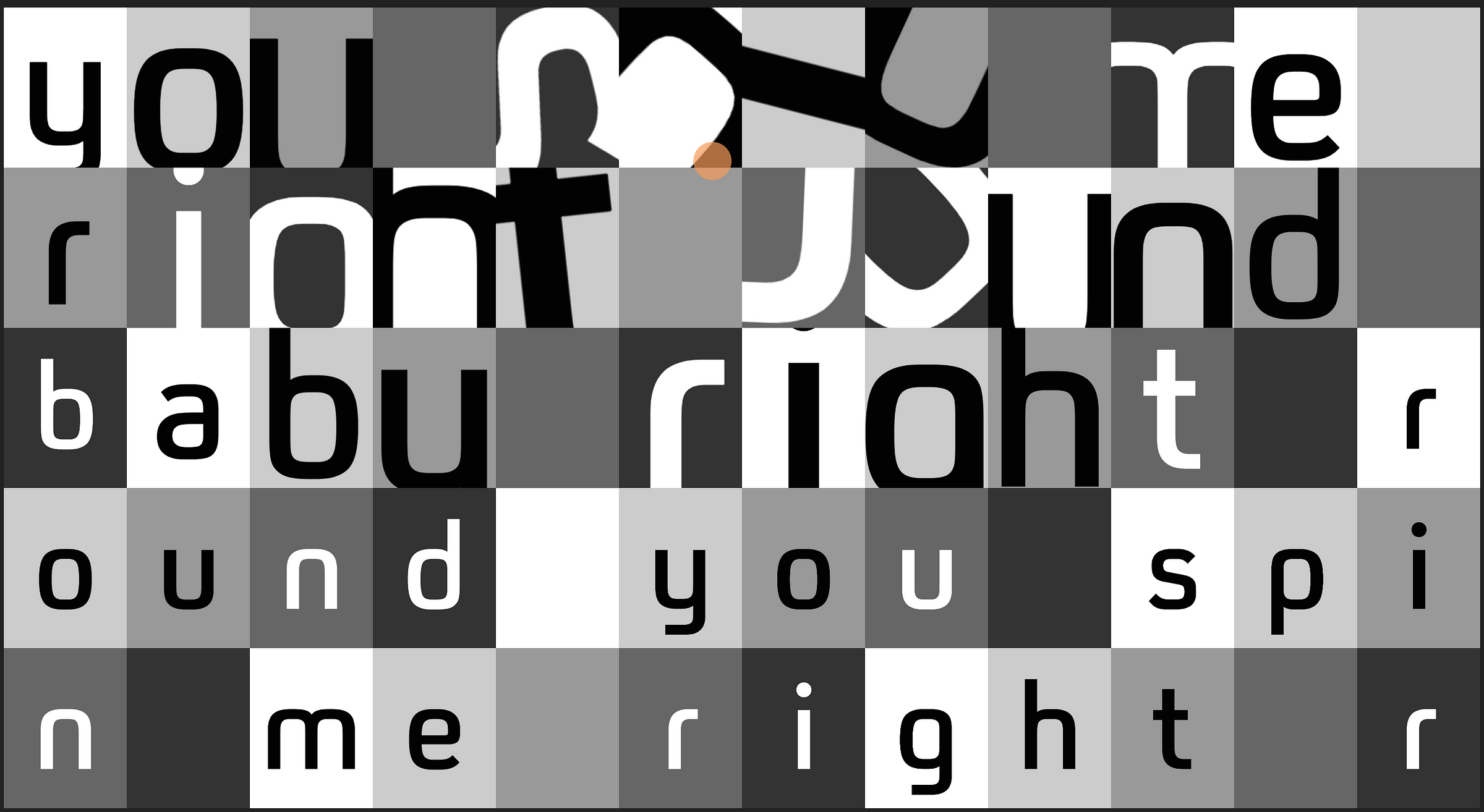
Action Condensed by Commercial Type (action.commercialtype.com)
Love it or hate it, you have to give Project Projects major credit for pushing the limits on this flamboyant design. Every time I come back to the site I notice something new, and experience it in a totally new way.
Erik van Blokland designed this typeface specifically for user interface, and it’s great to see it used in this manner, and pushed to the extreme. I encourage all to indulge in this interactive eye candy and to go all out pressing those buttons and sliding those sliders.
FS Untitled by Fontsmith (fontsmith.com/fs-untitled)
This self-proclaimed typographic playground (but more like amusement park), is one way to spend your afternoon. You won’t know where to start, but once you get going you won’t know where to stop. Shoot deadly pangrams (yes pangrams) in FS Zombies. Call upon the dead in FS Afterlife, and actually see the dead in FS ghosts. Play some music in FS Melody, and crank up the volume in FS11.
In the end, this made me remember why I love kinetic and interactive type in the first place. It’s accessible to the five-year-old who genuinely enjoys comic sans, but also entertaining to the nearest La Croix-sipping creative director.
Couture by Positype (couture.positype.com)
Finally, let’s roll out the red carpet, for the seductive and irresistible high contrast display face. To all you type nerds, take your time admiring those ball terminals and the thin hairlines. The unusual scrolling feature becomes especially exciting when you begin matching up parts of a word/character and watch it come to life. Don’t forget to stay for the grand ampersand reveal at the end.
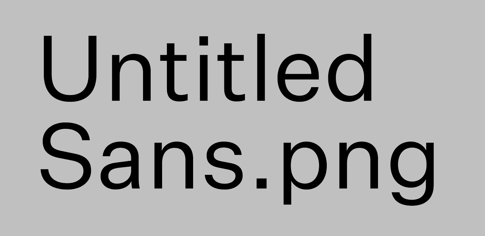
Untitled Sans & Untitled Serif by Klim Type Foundry (untitledsans.com & untitledserif.com)
You thought you were getting the hang of this microsite thing? Don’t speak too soon, because Klim’s Untitled siblings are coming your way. So I looked at a lot of microsites — and this pair of microsites is the antithesis of every other one I encountered. I don’t want to say too much. It’s much more rewarding to experience them on your own. Go ahead; submerge yourself into utter normalcy at your own risk.
While you’re at it check out their Instagram presence—one for Untitled Sans, and another for Untitled Serif.
For those that are craving an explanation, read Klim’s process here.
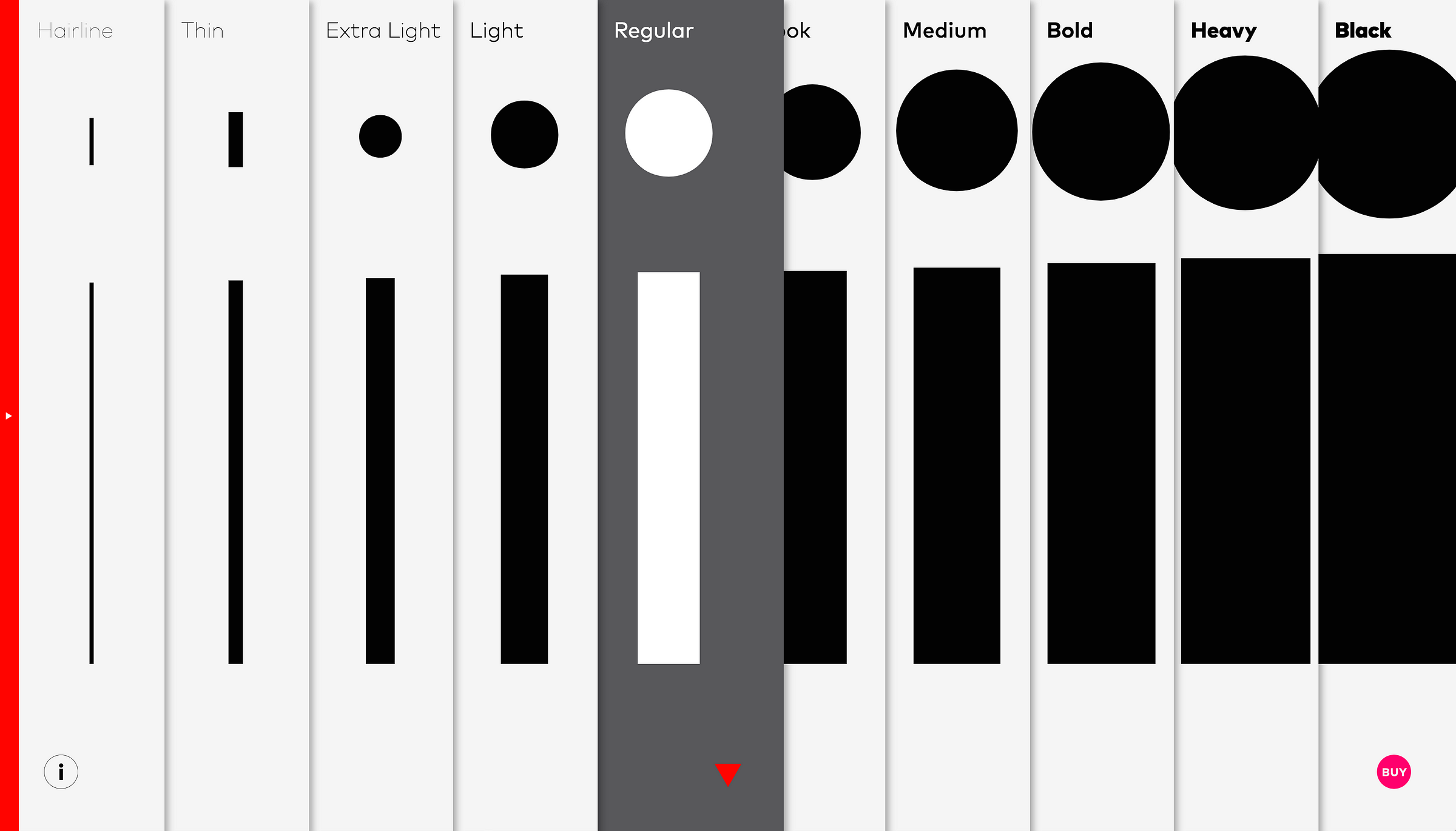
FF Mark by FontFont (ffmark.com)
It’s 2017, and there are a lot of geometric sans in the world right now. Every time I turn a corner there is one staring right back at me. So despite my skepticism when entering a site promoting yet another geometric sans, I was pleasantly surprised to see some really valuable content.
Bauhaus, and design process, and type history; I can’t think of a better way to win a designer’s heart. They even have a specimen of the Futura-predecessor Erbar Grotesk. I admit this isn’t my favorite use of interactivity in a microsite, the vertical organization of the weights seemed a little awkward, and at times some of the design doesn’t seem intuitive.
With that said, I think it’s a great example of a microsite moving beyond superficial specimen design, and actually providing valuable historical background that often goes overlooked. Now go read about that Erbar Grotesk to make up for all the credit it deserved but never received.
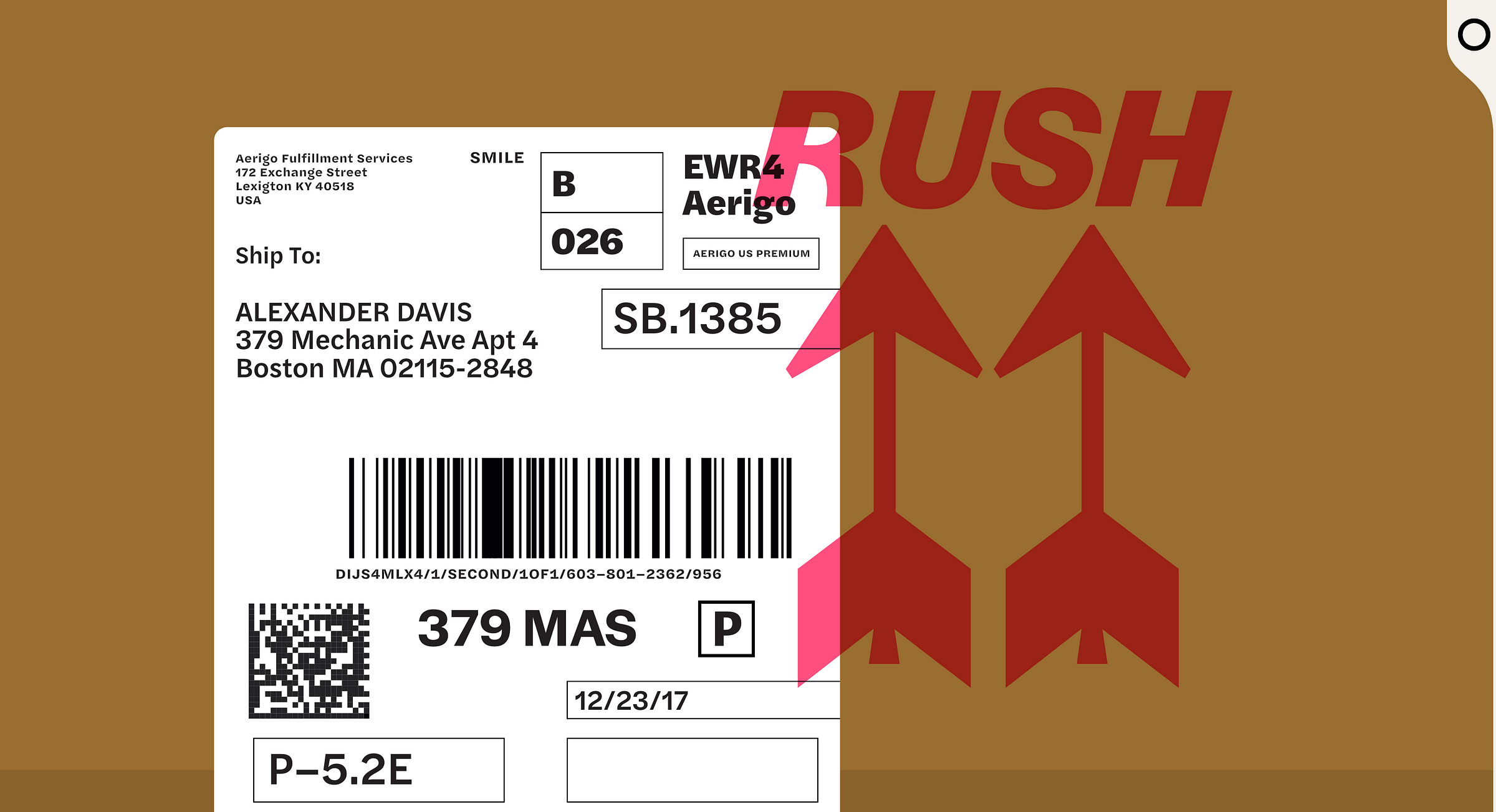
Halyard by Darden Studio (halyard.dardenstudio.com)
For those looking for a no-fuss, beautifully-crafted and incredibly practical sans serif, this one’s for you. Darden’s Halyard brings beauty to the banal and proves there is nothing a high-quality, well-hinted typeface can’t elevate.
Take your time with this one and soak up the details. The designers didn’t go for anything loud and attention-grabbing, but the subtle details in the illustration and typography really let it sing. The contrast between the numerals on the cargo and the unbelievable legibility of Halyard used on the digital map leaves me in total awe. Reminds us that a great typeface is a beautiful set of letters, not just a set of beautiful letters…it goes something like that, right?
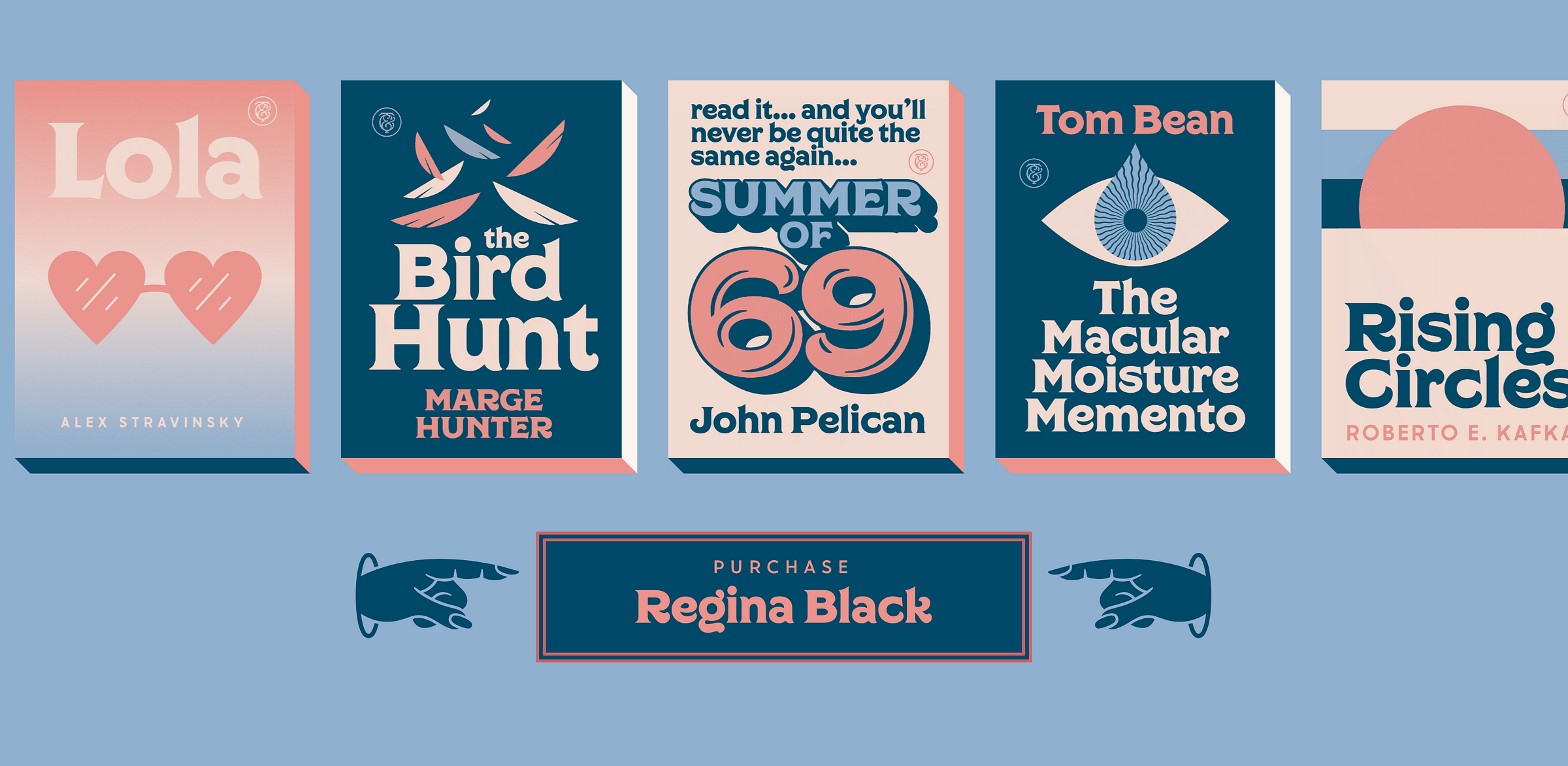
Regina Black by Charles & Thorne and Lost Type (regina-black.losttype.com)
Sassy manicules and tuscan-styled cursors? I couldn’t resist the charm of Regina Black’s microsite. Upon entering, I felt like I was catapulted into the 1970s with its warm color palette, and soft chunky type. The interaction here is subtle but a really nice nuanced touch — pay attention to the transforming cursor, it indicates whether something is clickable, or editable text.

Tick & Tock by Font Bureau (ticktock.fontbureau.com)
For those that don’t know Cyrus Highsmith’s “Inside Paragraphs”, this is a great introduction to his work and incredible letterforms. While Highsmith crafted the typefaces, we have to give credit to typographer and designer Nick Sherman who designed the page and the experience. I was very impressed with Sherman’s unexpected, yet much admired, approach to the microsite. If we take a step back and think about the inherent nature of a stencil, it is a category of type invented solely for physical and practical purposes. The microsite blurs that boundary and creates an interesting tension between the digital and analog world.
There you have it folks! If you liked this collection, share the heck out of it — you can spread the word and distract all your coworkers with your new valuable internet treasure.
Are there any microsites you have discovered that you think should’ve been included? We would love to hear from you! Plus, our Weekly Typographic newsletter is a roundup of the best typography and design news, and we are always on the search for great projects to feature or news to share.